Shu Hui's Blog
http://all-things-aep.blogspot.sg/2012/08/above-world-lee-shu-hui-pencil-sketch.html?showComment=1347633398396#c558284425714482829
Cai Wen's Blog
http://invinsibilitycloak.tumblr.com/post/31515039769/kimono-making-these-are-the-sakura-petals-that-i#disqus_thread
Si Ting's Blog
http://crenatedpineapple.blogspot.sg/2012/07/pineapple-invasion-i.html#comment-form
Pang Xin's Blog
http://hazydreamerneko.blogspot.sg/2012/09/inspiration-cherriuki-and-my-own-art.html#comment-form
Xin Ying's Blog
http://artsy-inspirations.blogspot.sg/2012/09/ny-95th-anniversary-card.html#comment-form
Friday, September 14, 2012
Work at home # ?? - VAN GOGH AGAIN
Van Gogh - Starry night over the Rhone

As you all know, i have this Van Gogh craze and i just love all his starry night paintings!! I like his style where the brushstrokes is obvious and the fact that he uses almost only blue, yellow, white and black in his starry night paintings. After the previous Starry Night replication painting i've done, I couldnt get over the fact that this 'master piece' of mine was taken away by one of the visitor at my house. He really liked it and he asked for it. I regretted after i gave it to him!!! I loved it soooo much......
So i decided to do another replica painting!!! <3 And this one is starry night over the Rhone. For this painting, i like how the light reflects off the surface of the water and how the sky looks clearer and brighter~
Here's my 70% done painting!! ( i really need to find time to complete it!!!)

Comparing the actual one to mine side by side, there is alot of difference, the most obious being the color of the blue. However, this is my depiction of it and i really like it! Whats missing is the reflection on the water and the hill like thing at the bottom. But looking at the base, i really like it and the atmosphere it has. I think it really can make you feel peaceful and make you feel like you are actually in the painting!!! <3
I shall complete it soon!!!!!!
Byeeeeee!!! <3
I LOVE VAN GOGHHHHHHH~~ <3 WHOO
Self Portrait Sec 3 Assignment
Self Portrait
This self portrait was done when i was Sec 3 with charcoal. Looking back, i think i would like to evaluate it and just give some simple comments.~

Here it is!!! <3
I think overall its not too good nor is it too bad. One thing is the eyes. From far and at a glance, it looks fine. However, if you look at it for a longer period of time, it kind of look like this dark hole waiting to take you in and its a bit scary for a happy self portrait. There can also be more obvious highlights on the hair so that it is not only plain old solid black hair. The shadows on the face seems a little unnatural and that should be worked on, same as the clothing where the soft smooth characteristics of the cloth was not well illustrated. The shadow on the left shoulder is also too dark compared to the rest of the drawing. And overall, the face should be lighter too~
Well thats all~ maybe i shall take these into consideration and do another self portrait soon!!
inspiration - artist - Emil Alzamora
Emil Alzamora
He was born in Lima, Peru and is a inspiring sculptor.
Artist statement: The human form is constant within my work. I am interested in exploring what it means to inhabit one, often exaggerating or distorting different aspects of the form to reveal an emotional or physical situation, or to tell a story about a predicament or an occurrence. Limitations and potential are as human as the flesh, yet hardly as tangible. In my works i strive to make visible this interaction.
As for me, i feel this connection with this artist because i am also interesting in the human form and instead of distorting it, i look more it to different ways to illustrate it in different materials and methods. I find his depiction of these human forms very interesting and is very inspired to go further with what i am interested in and just go ahead and create.

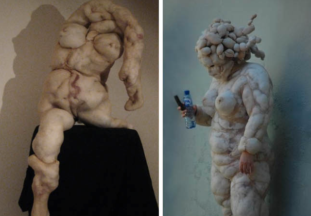
This is a very distorted figure where the position of the arms and legs are just so confusing. However, i can feel this tension from the work and there is this feeling of distress and frustration in the work. I really like works that can evoke a clear emotion to the viewer as i feel that that make the viewer feel more connected to the work.

This work is very similar to my course work where i also took the human body and morphed it with parts of the animal in which case he took the head of a cow. The positioning of the body is also very new and how the lower body twist away from the upper body is done so naturally and smoothly, it almost look like a artistic pose! haha
This one can be said to be creepy but this creates a very tensed mood in the exhibition room. It feel still and silent where it looks like the soul is leaving the body.
This one gives a sense of balance and peace. Because to me, it look very peaceful, just like a fetus still in its mother's womb, protected and comfortable. The elongated arms makes the work look light and free, balancing on it.
This one gives a sense of struggle. Its like a struggle between right and wrong, being stretched by the pull of both sides. The way the figure leans towards the ground shows that its pained by choices given, not knowing what to do.
Finally this one tells me that it shows depression. The drooping head and shoulders looks like the person has given up and once again, the artist has elongated the arms, where it dangles from the shoulder, powerless and tired.
Go check him out!!
http://www.emilalzamora.com/
Go check him out!!
http://www.emilalzamora.com/
I find how this artist distorts the figures very natural where the positions of the figures doesnt look rigid or unnatural. And the mood in which each figure portrays is very clear and really creates this mood around it.
Maybe i should also try to elongate or just distort the features of the human body, creating a mood around it. That would be great! <3

This was something done by me just for fun. Its three heads stretching their necks and looking up towards the light. Perhaps this shows some similarities with what the artist have done~
Inspiration - artist- Maria Aparicio Puentes
Maria Aparicio Puentes
A female artist from Santiago de Chile. She creates very special works where she connects people and objects around them together with threads.
She has a very interesting way of using two different materials. She takes photographs (by Berta Pfirsich) and then sew on them.
Here are some of her works ( which i like most)

This one look very interesting where the toes are connected to the clothes. I cant seem to get a meaning out of it but it feels that its trying to show everything in our life is (kinda) connected~ The way she uses the photo and thread looks very natural yet surreal. I think this is because she uses specific points on objects like the middle of the toes to the dots on the pattern of the shirt, instead of just random points everywhere.

This one i really like. At first, it just look like stitching on the bed or just some curtain like thing attatched to the bed. But as your eyes follow the stitch that goes down the bed, it connects onto the figure and this kind of confuses the viewer, thinking whether this is real or not.

This just feel like a wide lens camera, capturing everything or peripheral vision. The strings some how messes with the perspective and gets the viewer thinking.

This is another one of my favourite. This one, the lines highlights the sense of perspective and also giving it a sense of space.

This one, the idea is interesting although it does not have as much creativity as her other works has.

I really like this one as she just creates lines on the hair and it kind of shows how the hair falls and slowly falls over the shoulders. It makes us look at the image in a different way.

This looks as if these lines are everywhere in our everyday lives as it looks just so very realistic, blending into the photo very naturally and at the same time, illustrating the connection between human and object.

Finally I would like to compare these two works. The photos are exactly the same, just that the lines are different. The one above give me a feeling like its about exploration, where the lines creep up slowly taking the ideas of the images on the table to the people. While the one below depicts solid geometric shapes and it looks like the people in the photo knew exactly what they are looking for, where the lines go straight towards them.

I feel that this is a very easy yet creative form of art. I would really love to try it out. As for me, I will take a picture that has very obvious sense of perspective and using the lines, create a totally opposite perspective and this should keep the viewer thinking. To me this art is all about imagination and alot on creativity. I guess this has inspired me to just go ahead and be creative as we would never know before we try! <3
Go check out more of her works on her website!!
Here's another interesting artist that i did not cover. His style of art is very similar to Maria's one where he also uses threads. However, he made it even bigger, into installations~ go check it out!
cargocollective.com

just so you get an idea!
Have Fun!!! <3
Thursday, September 13, 2012
Inspirataion - artist - Ros Verloop
Ros Verloop
Dutch artist Rosa has extended her body work with nylon sculptures. These textural pieces capitalize on the medium used: stockings, which are tucked and moulded to create a distinctly human-like figure. The colours of the nylon fortify the anthropomorphic qualities of the work, which is manipulated in an organic fashion with drawing pins to create something strangely exotic. (http://inspiringartists.wordpress.com/)
To me, the ability to manipulate different materials fluently is very important.
This way the more materials you can manipulate, the larger the range of art techniques you can master. And i think that is a important part of development for art.
And i find that this artist has a very interesting idea plus she is very skilled in manipulation of her materials.
This way the more materials you can manipulate, the larger the range of art techniques you can master. And i think that is a important part of development for art.
And i find that this artist has a very interesting idea plus she is very skilled in manipulation of her materials.

She used this everyday material that no one would every think of using to create this sculpture. When i look at this sculpture, i see it with different emotions. Part of me really appreciates how this is made but the other half of me thinks that it looks a little bit gross you can say. She uses pins to pin down the nylon cloth, creating shapes, texture and depth.

Zoomed out view of the sculpture.
Some how i find that if you view this sculpture from this distance, it actually looks quite nice!

View of the whole sculpture.
For me, i think this is the kind of art that i think shocks the viewer and may not appeal to or be appreciated by all viewers. However, the reason i appreciate is not really because of how it looks like but because of the process of it. I can imagine how she had to position all the pins and pinned the cloth down to create the sculpture. When i look at a piece of art, i always think of the process which the artist goes through and how did they actually do it.
Here are some other works and here is a full body art. The one on the left is actually of this biomorphic image of a figure and i can't say i like how it looks, but i just like the idea of it.
What i really like is the one on the right where a actual person is wearing the costume/sculpture. This makes it a sculpture and at the same time a form of performance art. Because of the effect that the nylon creates, it basically just looks like fats. So I would guess that the work may mean that body image should not trouble people as well like what everyone say ' its not the outside that counts, its whats inside that counts' So inside and underneath the work may stand a beautiful lady.

Here is another one where the artist combines her sculpture ( the one on the right) and a person wearing the sculpture piece/ costume. This is interesting where the person just blends in and fits in nicely.
To me, this is the perfect example of impressive manipulation of material, creativity, and impact. It really creates this impact on the viewer and leaves a very deep impression.
Using this inspiration, i've attempted to also work with materials like nylon to experience the process.
And here are some sock puppets i've made!

Works at home # ( i've lost count) - art, cake and book?
Decoden
I think it is simply decorating normal everyday objects wit h cute stufff. And the 'cute stuff' refers to miniature pastries, charms of cartoon characters, hearts and ribbons maybe pink and fluffy things too.
Here are some pictures of what some others have done:


so it can be on phones, boxes and even note books. Here is one done by one of my favourite youtuber:
So i simply go through the same steps where i used air dry clay ( as it is light weight so that it will not weigh the objects i am decoden-ing on.
i create these cakes and pastries using moulds or just creating them myself, then while it dry, i can add the fake whipped cream which is usually silicone (for gap fill! haha) and also dust them with some powder from soft pastel ( the on in the video is made specially for this.... the pastel is just an alternative) then using paint to represent chocolate, the 'pastries will then be done!!!

i use the brown puffy paint because it dries puffy and not flat, so that it creates this thick chocolate look~ <3
Here are some that i made :

As you can see, i use pink silicone ( i simply added colour to it) as whipped cream and the paint really looks like chocolate. I added some rhinestones just so that it looks nicer, with more color. ( These are the not-so-nice ones because the nicer ones are all used for other projects)

As for the silicone whipped cream, i just attached a piping tip onto the silicone tube so it really functions like pipped whipped cream.
But before i was able to get the silicone, i attempted making my own whipped cream. I mixed part air dry clay with white glue. It worked well at first however, due to the fact that i added too much glue and also it takes a longer time to dry, it formed into a mess of gooey stuff. but it was too late for me to do any changes as i have already attached the cakes and pastries to it. I worked around it and i think it came out nicer than i expected!!

I used the paint to add swirls to it together with some rhinestones

So its basically just a plain notebook covered with goodnessssss~~~

close up on the waffle and cupcakeeeeee~!
you can see a bit of shading from the pastel powder and the shine is done by the varnish~ <3
I am really proud of this considering that this is the first time i tried it without the usual materials people usually use. It was a enjoyable process and i had fun! <3
I also did more ( they were really sucessful) of this for teachers day as presents.We made notebooks and pens ( with my friends) for the teachers.... unfortunately... I did not take a photo of it...... NOOOOOOOOOOOO
Oh and i've also done some using baking clay! <3
-insert picture-
they are more durable but they are heavy... D:

HERES A RILAKKUMA TO MAKE YOU HAPPY!
go eat a cookie!!! bye~ <3
Subscribe to:
Posts (Atom)