Thursday, September 13, 2012

Works at home # ( i've lost count) - art, cake and book?

Decoden
I think it  is simply decorating normal everyday objects wit h cute stufff. And the 'cute stuff' refers to miniature pastries, charms of cartoon characters, hearts and ribbons maybe pink and fluffy things too.
Here are some pictures of what some others have done:
Click the image to open in full size.

Click the image to open in full size.

Click the image to open in full size.


so it can be on phones, boxes and even note books. Here is one done by one of my favourite youtuber:


So i simply go through the same steps where i used air dry clay ( as it is light weight so that it will not weigh the objects i am decoden-ing on.
i create these cakes and pastries using moulds or just creating them myself, then while it dry, i can add the fake whipped cream which is usually silicone (for gap fill! haha) and also dust them with some powder from soft pastel ( the on in the video is made specially for this.... the pastel is just an alternative) then using paint to represent chocolate, the 'pastries will then be done!!!
i use the brown puffy paint because it dries puffy and not flat, so that it creates this thick chocolate look~ <3

Here are some that i made :

As you can see, i use pink silicone ( i simply added colour to it) as whipped cream and the paint really looks like chocolate. I added some rhinestones just so that it looks nicer, with more color. ( These are the not-so-nice ones because the nicer ones are all used for other projects)

As for the silicone whipped cream, i just attached a piping tip onto the silicone tube so it really functions like pipped whipped cream. 

But before i was able to get the silicone, i attempted making my own whipped cream. I mixed part air dry clay with white glue. It worked well at first however, due to the fact that i added too much glue and also it takes a longer time to dry, it formed into a mess of gooey stuff. but it was too late for me to do any changes as i have already attached the cakes and pastries to it. I worked around it and i think it came out nicer than i expected!!
I used the paint to add swirls to it together with some rhinestones

So its basically just a plain notebook covered with goodnessssss~~~

close up on the waffle and cupcakeeeeee~! 
you can see a bit of shading from the pastel powder and the shine is done by the varnish~ <3

I am really proud of this considering that this is the first time i tried it without the usual materials people usually use. It was a enjoyable process and i had fun! <3
I also did more ( they were really sucessful) of this for teachers day as presents.We made notebooks and pens ( with my friends) for the teachers.... unfortunately... I did not take a photo of it...... NOOOOOOOOOOOO

Oh and i've also done some using baking clay! <3 
-insert picture-
they are more durable but they are heavy... D:

HERES A RILAKKUMA TO MAKE YOU HAPPY!

 go eat a cookie!!! bye~ <3


Works - Nanyang 95th Birthday Card

Happy 95th Nanyang!

This is an assignment given to us by the school, and well, i never did like card making. I've always lacked the creativity, always had bad choices of colors and well, the contents are never touching , just the normal congratulation and thank yous. So i thought, since cards are always flat and boring, i shall change that. So i set my mind into creating a pop-up card. I wanted to keep my design simple yet meaningful ( well it is for the school's anniversary) i think less is more. So i set my self on two colors, red which represents the red brick walls which i think represents the school building best, together with a very neutral colour, yellow. But for the yellow, i used paper with alittle bit more texture so that it is not too boring.
First i set off with my research on how to create pop up buildings. 
To tell you the truth, i first got the idea of the pop-up card, partly because of this one card that looks like the one above where when you open this boring looking card, comes a wonderful surprise. I would really want my card to look like that and also make the viewer feel surprised. 
I also thought of making the words ' happy birthday' or  '馨' pop-up but i though the focus of the card should be on the school instead of just birthday. So i decided that the school building shall be the one that pops up~
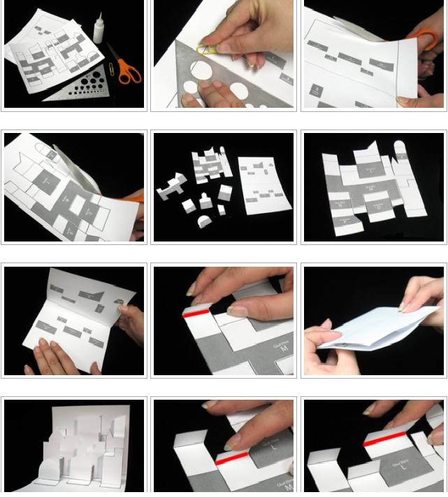
Here i tried to experiment on how to actually create the pop-up effect like where to cut for what to pop-up. It was a really frustrating process where i drew many pictures of the school and cutting it up but failing to succeed. I went online for help and found out that you can actually print templates. so that was what i did. 
I printed it and followed the instructions to get a hang of how it actually works~
and i conclude.... what ever you cut.... NEVER cut the horizontal lines!! :D

And i got some more reference pictures from the internet
i really wanted to do something like this... but i dont think i can create the school building with some thing like this...
This is a great reference picture for my work as i think this somehow resembles the school building the most as compared to some other pictures i found. 
After much experimentation, i finally came up with the final design on my pop up.
i cut it out using the red paper and stuck it onto the yellow card.

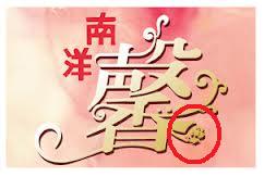
As for the front and back design, i wanted to do something simple so i went ahead to cut out the chinese word 馨. 
it was not easy especially the area wit the flower pattern on it. so i decided to exclude that part.


But i thought the flower is a very nice part of the word! 
so i drew that out and cut it out in the red paper. It actually came out very nice! so i decided to expand on the pattern and develop on the idea. i drew a bunch of them branching out and cut them out, sticking them onto the front of the card, together with the red words 南洋.

I thought i was done, however the card looks very unfinished especially the school which was just plain red. so i cut strips of white paper to cove the areas which are the white pillars of the school and behind the pop-up i placed some black paper to give the cut out windows depth. 
 

OH! i almost forgot about the part that im most proud of!! it is this spining wheel at the corner~! The NY5 skit really inspired me for that .


In it, one of them said that " the reason i came to this school.. is for  this swing' and i think that is really very cute! so based on that, I told a simple 'story' of how a loney girl made friends~~ <3
basically its something like that, where the wheel will spit and different images will be shown. 
Finally for the card, i just added some glitter to the card to add some 'bling' to it~
TAH DAH! here's the final product


Inspirations - artists - Michelle Matson

Michelle Matson
This artist is another one of the contestants of Work Of Art season 2 ( just go check out everyone http://www.bravotv.com/work-of-art/season-2/bios they are all amazing artists and are all very inspiring) 
Well, comparing her to Sarah Kabot ( mentioned in my previous post) SHE IS THE GREATEST ARTIST ON THE PLANET (to me that is ). Like me,  she is also a fan of human figures. And she is the greatest inspiration i've ever came across. Her creativity in using very common materials and her ability in the manipulation of the material just adds up to perfection ( to me) . the first episode, she came in with this AMAZING self portrait of herself. And at that moment. That was it. I was her number one fan. 
You can say that it does not look like her ( i think it kinda resembles her in terms of the shape of the face, the nose and the brows) but hey, to be able to do that with just coloured paper, thats wow...

Here she is! :
Michelle
Her style of art is very very special ( at least i've never seen it before) 
Here are some photos of her works: get ready to be wowed!
(dosent this remind you of songebob?) 
anyway, take note of the way she curl and cut the paper to create contours of the shoulder and collar bone, the circular or round-ish pieces of paper that come together to create the face and the curled paper that forms the beard and hair. Ususally, we would think that to create a 3D object using paper, is like origami, we fold it. But for her, she actually layers the pieces of paper, at most curling them to create the shape. I find the way she is able to break down the image to different sections and piece them together using paper is similar to how a cubist would create their works ( just that her's is not so 'cube like' in a way that it is not of geometric shapes and lines overlapping each other) She re-interpreted  the work and translated it into overlapping sheets of paper. 
upon seeing it at a glance you can tell that it is a old woman. Well i think it is not purely because she has white hair but also because Michelle used smaller pieces of paper layered on the face instead of larger ones as seen above ( and below) . And this makes the face look wrinkly and rough. how the hands are made looks simple but using paper to create the curve of the arm is quite difficult. She has to take note of how wide each ring that forms the arm is so as to create this smooth curved shape. And the hands are just wow. The way the fingers bend makes it look so live like . I say this because i think paper is not really a very flexible material and for it to make such a smooth rounded surface of the face and the slender bent fingers really requires skill.
This work may look like any one of her head sculpture ( i think we can consider this to be a sculpture.. haha)  but look at the shades the woman is wearing. It is not a translucent piece of plastic placed over the face, but is made of different coloured paper ( gray and black) that forms the eyes, making it look like she is wearing sunglasses. The use of color is what makes the work amazing and if you noticed the background, it is actually a painting. The way she puts this two contrasting elements together  allows them to complement each other. 
The part about this work that i really like is not the face nor the arms ( though looking at the way the fingers are created, it is beautifullllllllllllllllllllllllllllll) The checkered shirt is actually made with circular sheets of blue paper with lines of red green and yellow laid over it to make it look like a checkered shirt. The process must have been extremely tedious. and the next thing that amazes me is the print on the t-shirt under the checkered shirt. The image is also made by paper cut out... so it is really quite impressive how she can make all this believable where the clothing actually tricked me to thinking that it is actually cloth when it is made of pieces of paper.  

Although this work is much simpler than her previous works , i think this has deep meaning to her. Notice how it is missing some teeth? well she was actually involved in quite a big bike accident, being the victim, she has suffered a lot from it and i think she wants to show that through this piece of work.


I find this very interesting because i think paper behaves very much like how a plant does, some times rigid but can also be very flexible at times depending on how they are like. The mushrooms are very realistic especially the area under the cap, she made use of the paper's edges to create this. The grass and leaves also looks realistic  ( may be just abit too perfect) but the overall effect is really like a pot of plant ( just that its on half a disco ball) 

Now this piece of work is the few of her bigger ones where she tackles the challenge of creating full body sculptures. She uses the same technique of layering paper and i think she used wire or some kind of support ( well she must've) to made a base structure to create her work on. I would like to focus on how the legs of the person infront is done. it is very different from the layering done for the person behind. The legs are actually made up of rolls of paper instead of layers of paper. i think this can create the long rounded shape of the legs better and i think this trick would come in use for me~

and finally, here's one of her work commenting on pollution. And looking at the plinth of her work, it is not just a white piece of wood. It doubles as a concrete floor. I think this is a very creative way to present  her work.

Now i will show you something that i made that is inspired by her. 
I was given the challenge by my class to be in charged for the New Year Class decorations and thought, why not use this chance to create a work of art? >:D
here's a photo of it ( sorry about the quality... not that clear) 
 Using the technique that is influenced by her, i constructed this dragon in a similar fashion, where i used red packets of different colors up and piece them together to form the head. The eyes are also made with reference to the work above.( the one with the two hanging eyes) Then for some extra decorations, i just cut shapes out and attached it on to the head~
And yay!! our class were the champions for class decoration!~ <3
For something similar that i've done, this is actually cut out from templates and then folded and glued together. I would want to try designing my own template but i think i can only start with simple designs.... This one is made with four pages of packed cut-outs... here it is~ ( sorry bout the messy table) 
by the way, its the big ship, small one and the simple one is the head~ <3
This took me a few weeks to complete due to its difficulty...  i have a few more other ones that are not 100% completed so i will leave them out~

If u love Michelle too, 
Check her out! 

Inspirations - artist - Sarah Kabot

Sarah Kabot
well since Im very obsessed over her, I've mentioned her as my inspiration in almost all of my art works. 
After her debut in the the television show Work Of Art ( seriously, go watch it ), Her art style just caught my attention and immediately i was in love with how she works with her material and how she is able to create this illusion of space. Not shown alot in the television series are her skills in creating beautiful installations. She manipulates the 3D space similar to how M.C. Escher is able to manipulate the 2D space. 

Artist Statement

Making, for me, is an act of unraveling, of revealing structure at a precise level. The installations take visual cues and materials from a location to create a secondary experience of that location. Wall drawings analyze and amplify specific aspects of a chosen space, using the tools of repetition and subtlety to create tension between site and intervention. Repetition, inherent to the process, optically enhances and torques perception. And subtlety encourages the viewer to be attentive to the nuances of the transformation.
The work proposes an alteration in comprehension, encouraging the viewer to question his or her own perceptions. The meaning, significance, and even location of objects are not fixed. Potentially, everything could be different.

Sarah
here are some of her works: 
This is actually done on a flight of stairs. And i think she has the power to create perspective very well. She creates the illusion that there area actually geometric shapes floating or resting on the flight of stairs. The use of lines also creates this sense of movement. 

Here is another creative idea that produces wow-ing results. I especially like the one with the light switch. First there is the light switch itself. Then there is the extension of something like the skeleton of the light switch. And finally with the twist, comes the shadow of the skeleton. It is like a continuous extension of the things in the work. It can really confuse us sometimes. and it really just looks amazing. I would consider trying this out may with a different subject matter. I would like to see a human version of this. However i think it is that solid geometric shapes of the objects that is able to create this effect.

This work is totally surreal and you can say that it is almost 100% M.C. Escher style. The stairs that makes us question whether it goes up or down, whether is it upside down or right side up. This installation is like a 3D depiction of M.C .Escher's Art.

This artist creates creative art with new ideas. She likes to use white lines to create this hollow illusion that are like drawings of the objects but yet so real. Her works resemble those of M.C. Escher's alot and well, the illusion she create sometimes are very believable and really confuses the viewer at times. I guess is just like what she say, the viewer would have to pay more attention and create their own perception of her works.