Happy 95th Nanyang!
This is an assignment given to us by the school, and well, i never did like card making. I've always lacked the creativity, always had bad choices of colors and well, the contents are never touching , just the normal congratulation and thank yous. So i thought, since cards are always flat and boring, i shall change that. So i set my mind into creating a pop-up card. I wanted to keep my design simple yet meaningful ( well it is for the school's anniversary) i think less is more. So i set my self on two colors, red which represents the red brick walls which i think represents the school building best, together with a very neutral colour, yellow. But for the yellow, i used paper with alittle bit more texture so that it is not too boring.
First i set off with my research on how to create pop up buildings.
To tell you the truth, i first got the idea of the pop-up card, partly because of this one card that looks like the one above where when you open this boring looking card, comes a wonderful surprise. I would really want my card to look like that and also make the viewer feel surprised.

I also thought of making the words ' happy birthday' or '馨' pop-up but i though the focus of the card should be on the school instead of just birthday. So i decided that the school building shall be the one that pops up~
Here i tried to experiment on how to actually create the pop-up effect like where to cut for what to pop-up. It was a really frustrating process where i drew many pictures of the school and cutting it up but failing to succeed. I went online for help and found out that you can actually print templates. so that was what i did.
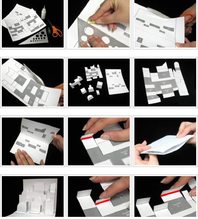
I printed it and followed the instructions to get a hang of how it actually works~
and i conclude.... what ever you cut.... NEVER cut the horizontal lines!! :D
And i got some more reference pictures from the internet

i really wanted to do something like this... but i dont think i can create the school building with some thing like this...

This is a great reference picture for my work as i think this somehow resembles the school building the most as compared to some other pictures i found.
After much experimentation, i finally came up with the final design on my pop up.
i cut it out using the red paper and stuck it onto the yellow card.
As for the front and back design, i wanted to do something simple so i went ahead to cut out the chinese word 馨.
it was not easy especially the area wit the flower pattern on it. so i decided to exclude that part.


But i thought the flower is a very nice part of the word!

so i drew that out and cut it out in the red paper. It actually came out very nice! so i decided to expand on the pattern and develop on the idea. i drew a bunch of them branching out and cut them out, sticking them onto the front of the card, together with the red words 南洋.
I thought i was done, however the card looks very unfinished especially the school which was just plain red. so i cut strips of white paper to cove the areas which are the white pillars of the school and behind the pop-up i placed some black paper to give the cut out windows depth.

OH! i almost forgot about the part that im most proud of!! it is this spining wheel at the corner~! The NY5 skit really inspired me for that .
In it, one of them said that " the reason i came to this school.. is for this swing' and i think that is really very cute! so based on that, I told a simple 'story' of how a loney girl made friends~~ <3
basically its something like that, where the wheel will spit and different images will be shown.

Finally for the card, i just added some glitter to the card to add some 'bling' to it~
TAH DAH! here's the final product

No comments:
Post a Comment